* All data and terms are mock or from public resources.
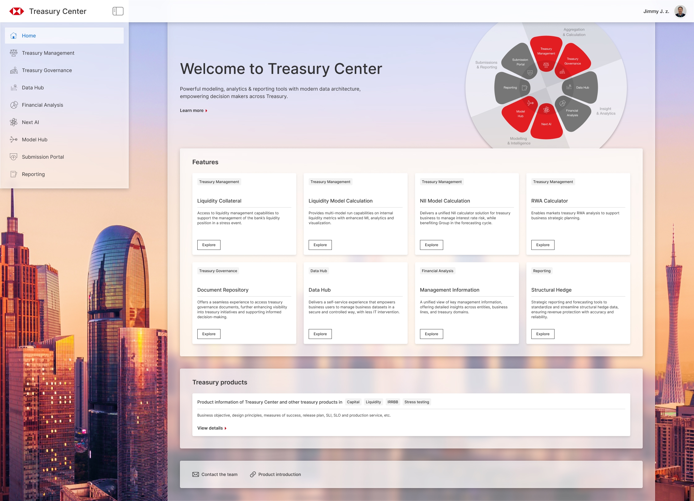
The Treasury Center centralizes a bank's core financial resources, including capital, funding, liquidity and balance sheet management. It provides data-driven insights to support strategic decision-making.
2024 - 2025
UX/UI Designer (with business analysis tasks) in a 100+ member team
Product launched and available to internal bank users. Collecting feedback for iteration.
Background
The Treasury Center provides access to all key treasury and financial metrics and analytics. With consistent data and report format, it helps bank senior managers and treasury specialists to gain more comprehensive, accurate business insights and drive better decision-making.
When developing this product, I collaborated with another talented UX designer to deliver designs, align with stakeholders, and oversee the implementation progress in a team of around 100 engineers, with fast-paced iteration.
Design Process
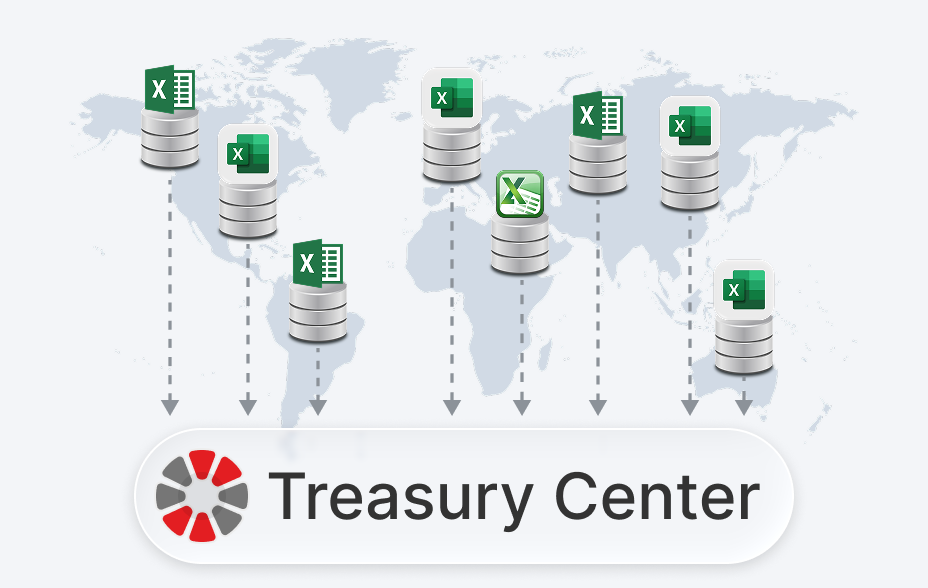
Most features were migrated from existing tools and platforms. Before the design phase, we conducted interview sessions with key internal stakeholders and users to understand the pain points in their previous workflows.
Below is our typical UX design process, along with the deliverables in each stage:
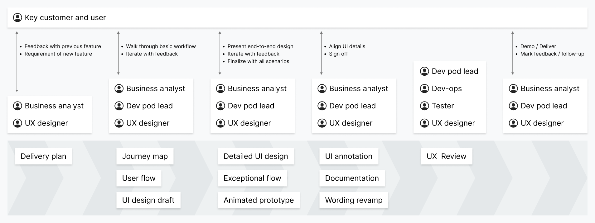
The process involves several rounds of discussions to reach final alignment. In the end, we obtained sign-off from key customers and users on the detailed designs before handing them over to the development team.
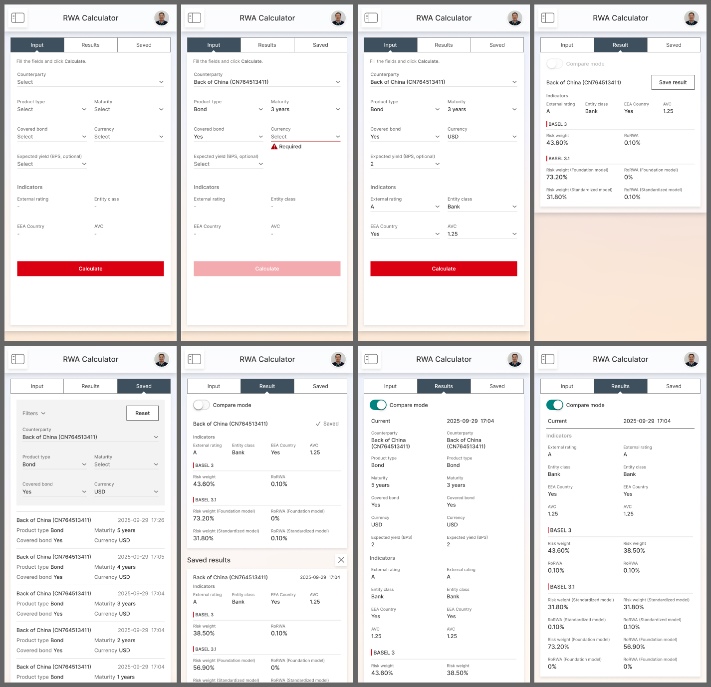
Below are sample screens of a RWA (Risk-Weighted Asset) quick calculation tool. This feature provides an efficient way to calculate RWA under specific scenarios and allow users to compare the results.
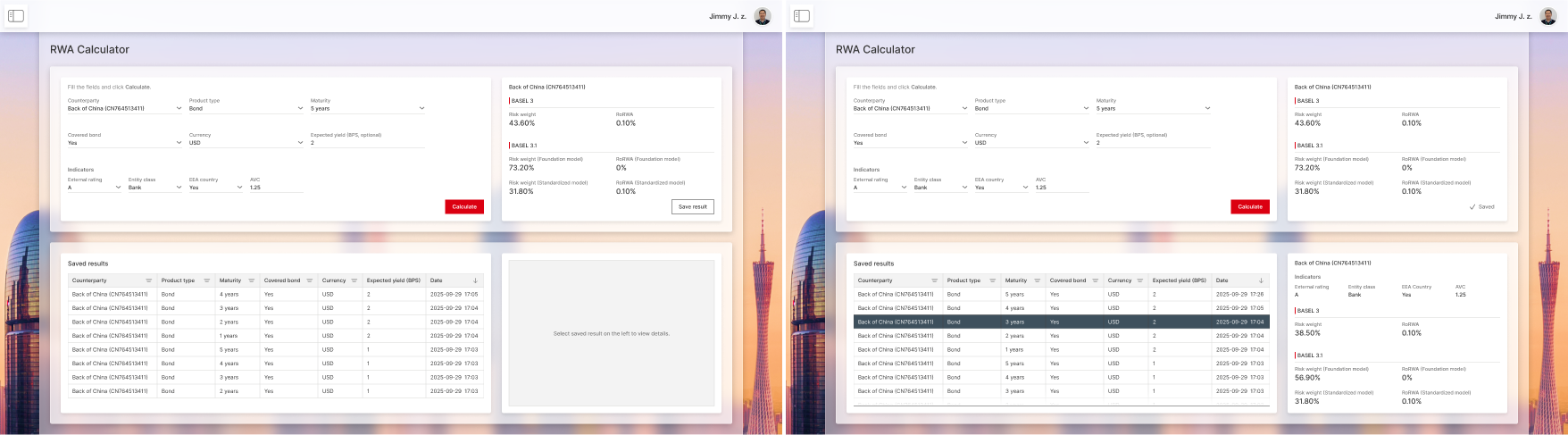
The mobile view includes an additional comparison mode:
Challenge 1 - Access Entitlement
With highly sensitive data involved, user access entitlement becomes a critical process. Every Treasury Center user should only access information relevant to their role within the system. It turns out to be a very complex design challenge.
Problem Statement
The bank has a large multi-hierarchical organizational structure. By default, a user should only be able to access the data from their region and business unit:
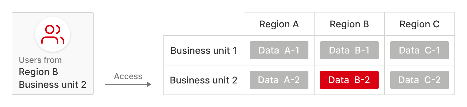
For senior managers in the bank, they may need to access data across different regions and business units.
We need to design a generic access control solution to ensure that each user accesses the right data in all features.
Research
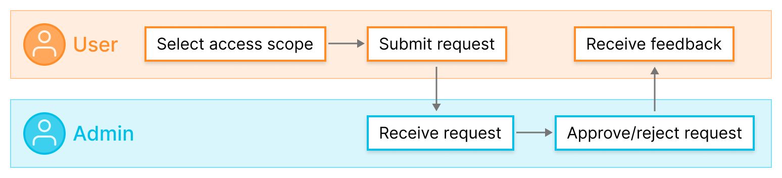
For analyzing the detailed requirements, I facilitated a series of workshops with stakeholders, and learned that we need to comply with the 'Maker-checker' process, which means a user requests access, and then another admin approves or rejects it. Users cannot grant access to themselves.
An early version journey for the application and approval process:
Each feature in the system menu has an independent access control, and every region and business unit has its own admins.
During the research, we found that the solution needs to support various cases:
- Some features use 'Entity' instead of 'Region', and there is a mapping between them.
- Besides Business units, some features also use 'Function groups'. Function groups have their own admins.
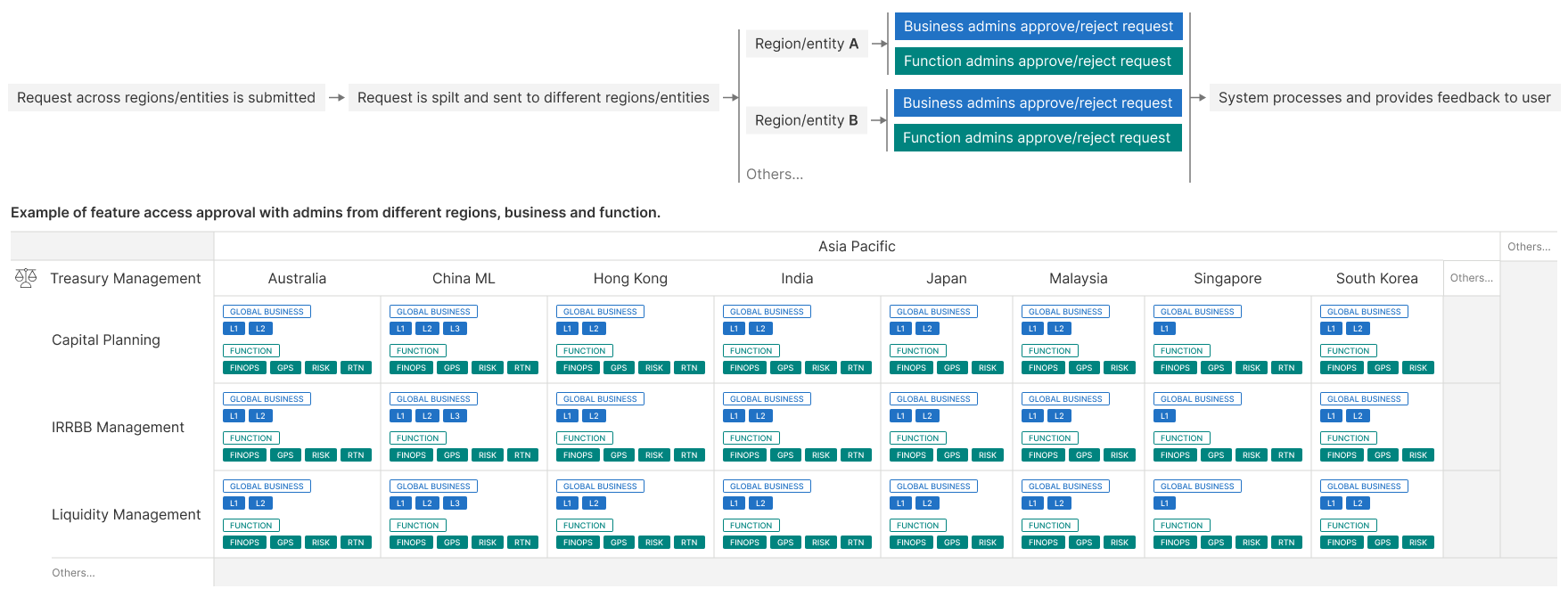
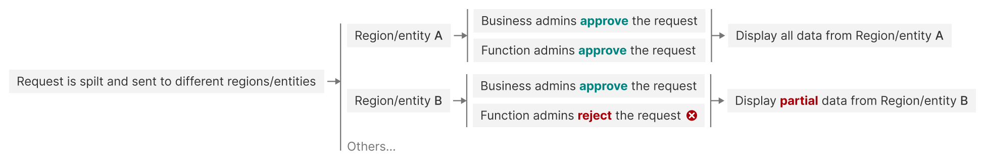
- If a user submits a request across Regions/Entities, the request needs to be split and sent to different admins for approval.
- Some features and data are managed by more than one admin...
This leads to a complicated situation with numerous possible combinations.
Below is the approval process for a request involving data across different Regions/Entities, along with an example diagram illustrating the relevant admins from Business units and Function groups:
We also thought through edge cases where some split requests are approved while others remain pending or rejected. This leads to a situation that the access application receives partial approval. As a result, users can access the feature, but data from certain Regions/Entities, Business units, and Function groups remains unavailable.
Solution
From the user's perspective, we designed a multi-level access entitlement structure. It supports distinct UIs for users with different access permissions, ensuring proper information disclosure while delivering clear, user-friendly feedback.
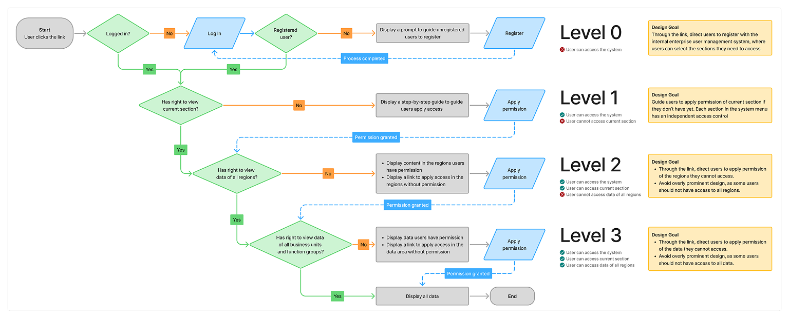
The following screens are the same page for users with different access permissions.
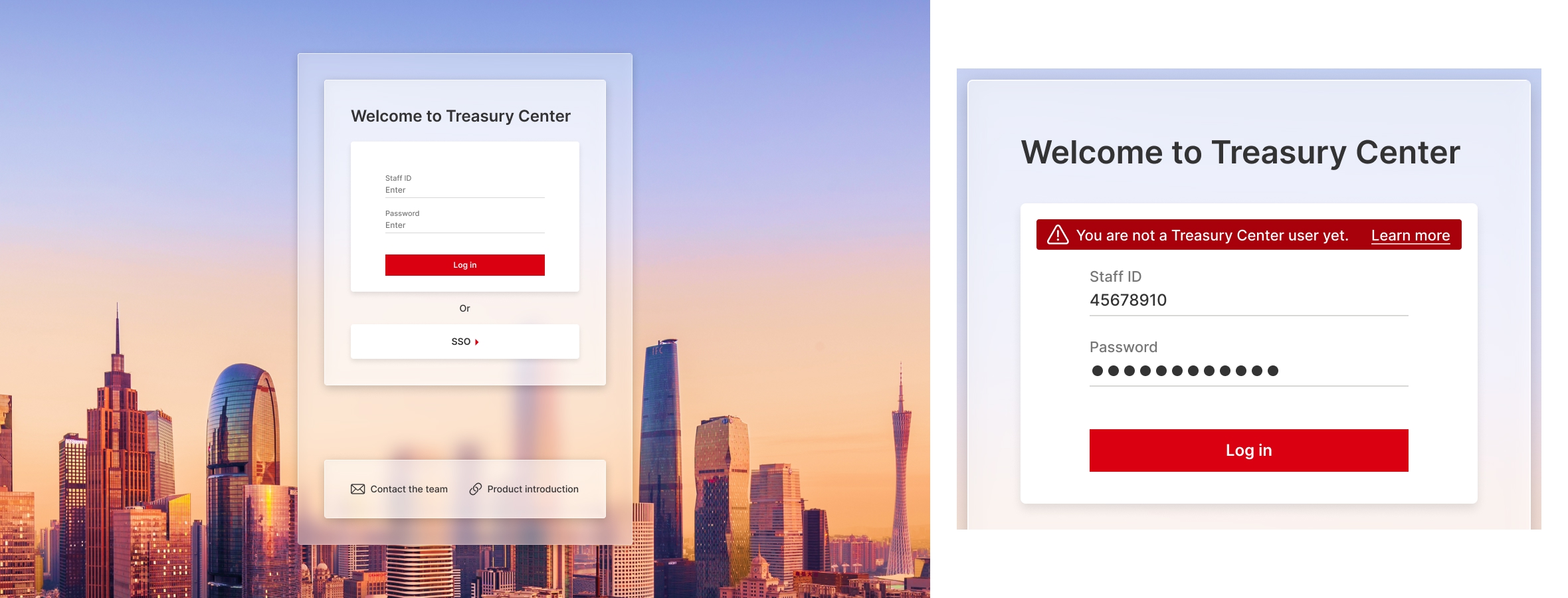
At Level 0, users are redirected to the login screen:
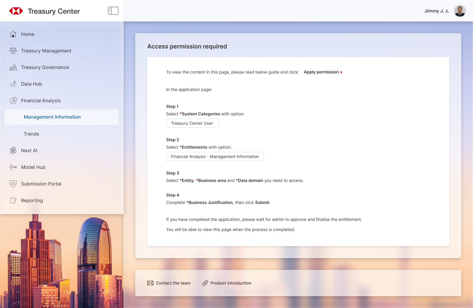
At Level 1, users see a step-by-step guide:
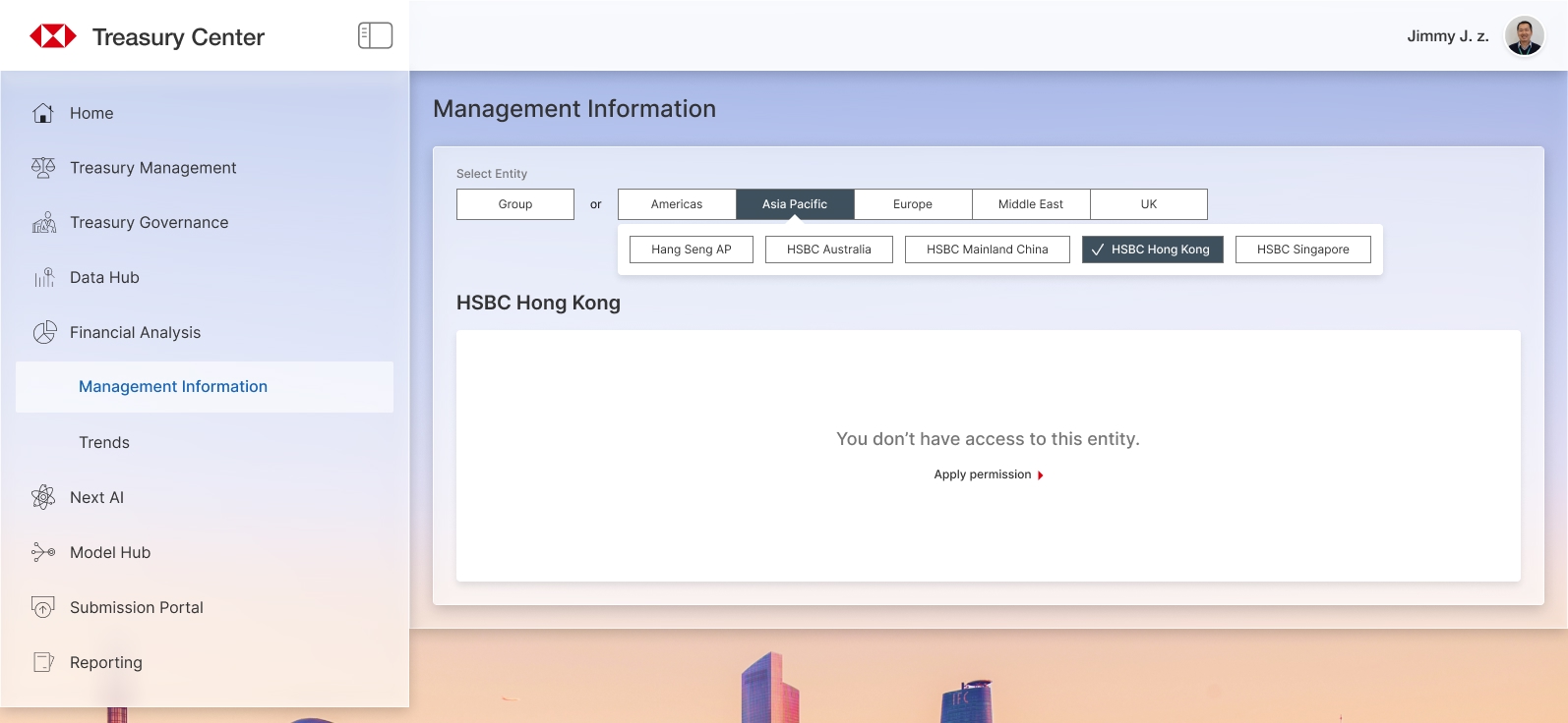
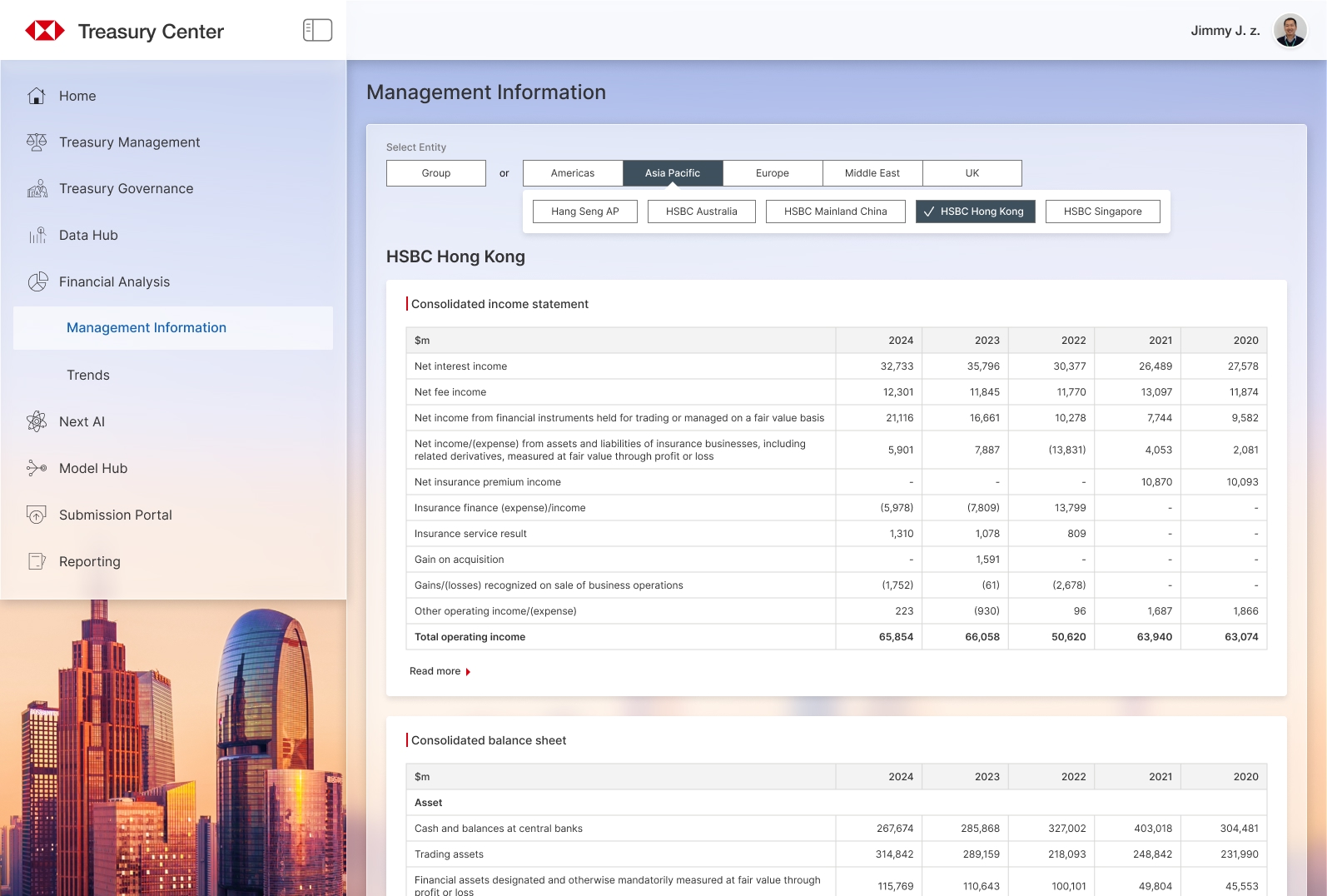
At Level 2, users can access the feature but may not see data from all Regions/Entities:
At Level 3, users can view all the content after permission is fully granted:
Edge Case
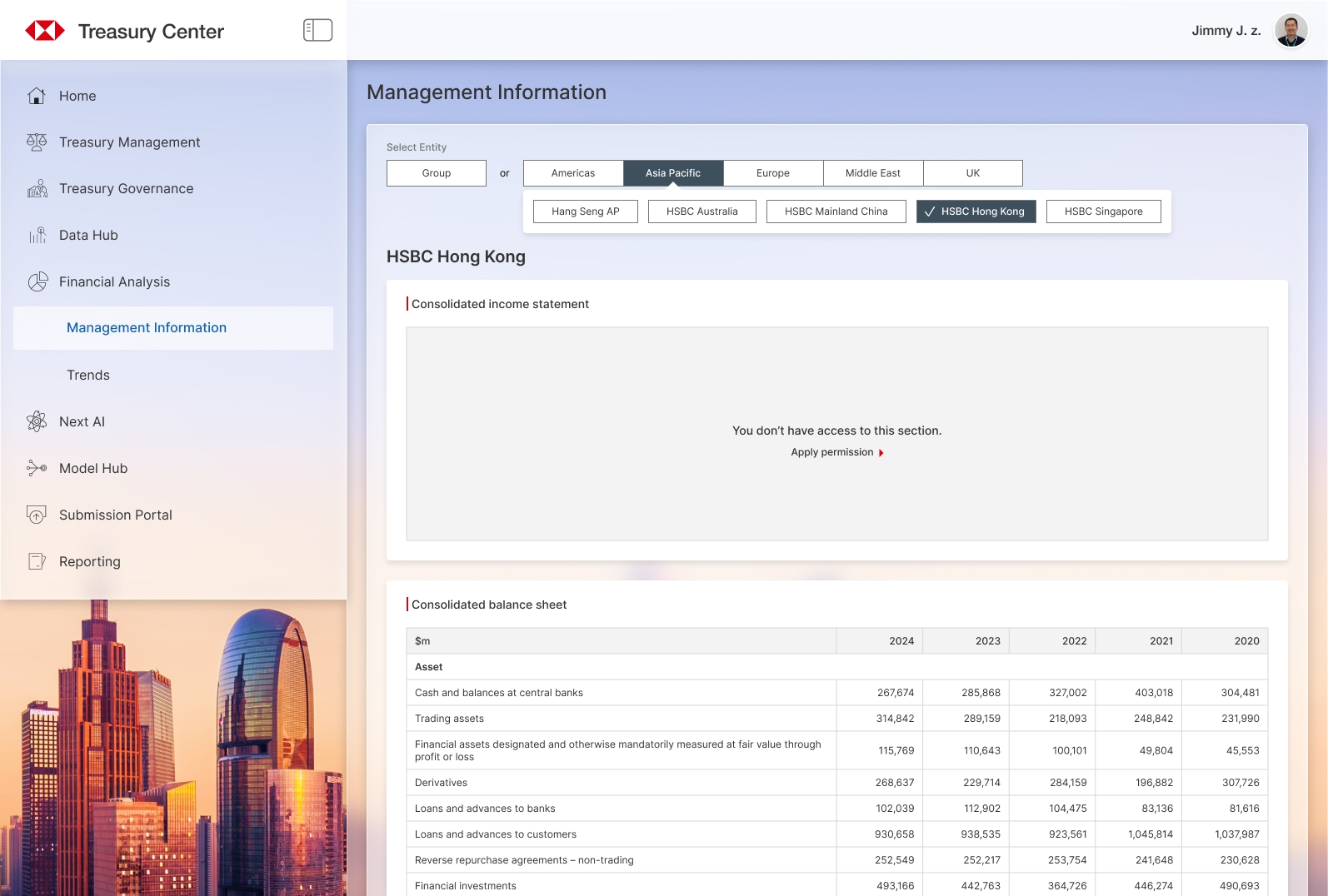
In some features, the access request requires both Business admin and Function admin to approve. Users cannot access the data until both admins have approved. However, in a rare case, some data can still be viewed without the approval from the Function admin.
We need to consider the UI in this case: display the partial data and provide an entry point to apply for permission again:
All data can be accessed after Function admin has approved the request.
Design Alternative
On the Level 2 screen, we considered only showing the Regions/Entities options that users can access and hiding the inaccessible ones. This approach would result in fewer selection options in the UI.
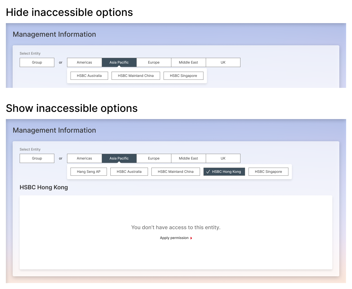
Our teammates held differing views on this approach. To resolve this, I facilitated meetings with key stakeholders and users, where I presented the pros and cons. Then we aligned on displaying all options for two main reasons:
- Our key users are senior managers, who typically oversee data across all regions. Instead of hiding inaccessible areas, it is better to provide a path for them to request access.
- Region visibility is not sensitive information. Hiding options may cause misunderstandings, such as the impression that the system is unable to fetch data from those areas.
Above are some samples during the design process. The complete solution is more complicated than presented here, such as involving additional read and write permissions in certain features. Managing this entitlement complexity was the project's greatest challenge, which we successfully overcame.
Challenge 2 - Feature Consistency
Another challenge is maintaining consistency among features from different business units.
Problem Statement
Treasury Center holds many features that are migrated from legacy platforms and tools. Some features serve very similar purposes, but work in totally different ways, because they are originally from different business units and were designed by different teams.
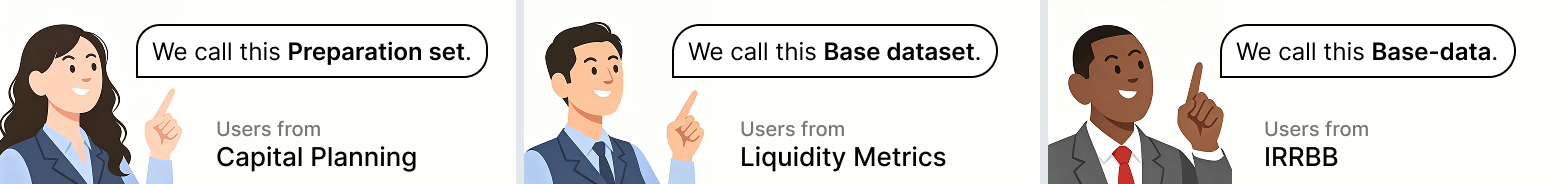
Take model calculation as an example, Treasury Center provides powerful model calculation capabilities which most business units can leverage. However, the terminology and interaction patterns are inconsistent across features. Even when referring to the same data, users from different business units use different terms:
From the product UX perspective, our goal is to align all the terminology and interaction patterns across features.
Research
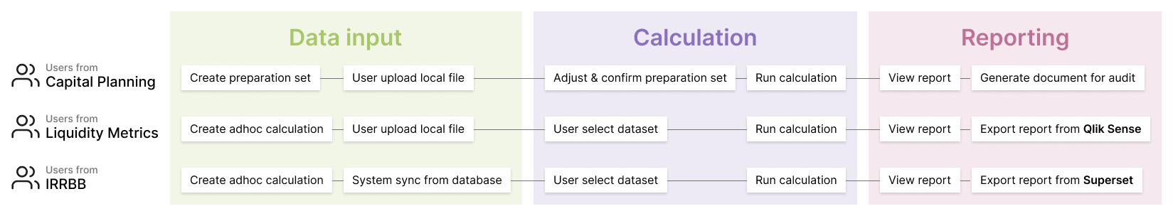
To align all model calculation features, we analyzed the business workflows in different units, and proposed a unified design since they all share a similar journey: get the data, calculate, then view result, which helps analyze the past and forecast the future.
However, the unified design received quite some negative feedback.
Users from different business units complained that the changes in terms and interaction patterns were 'meaningless', and made the experience no longer intuitive. They still preferred the process they used to work with, even though it was not consistent between business units.
Then I realized that sometimes 'More consistency' doesn't always mean 'Better UX'. Every little change in UI would cost users some effort to adapt. We should not ignore it when pursuing consistency.
Solution
Our design goal has switched to seeking a balance between maintaining as much consistency as possible and ensuring users can still interact with the features intuitively.
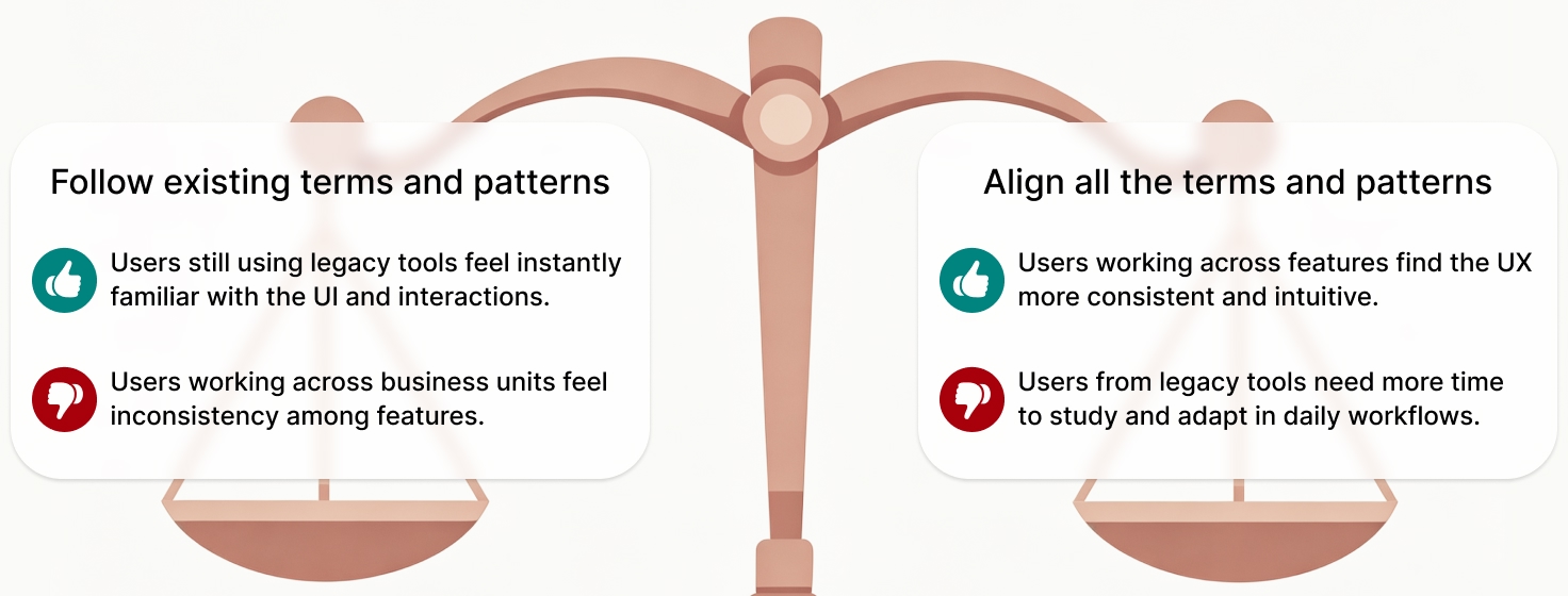
We updated the design by retaining the differences among features when necessary, and finally gained alignment with the key stakeholders from all business units.
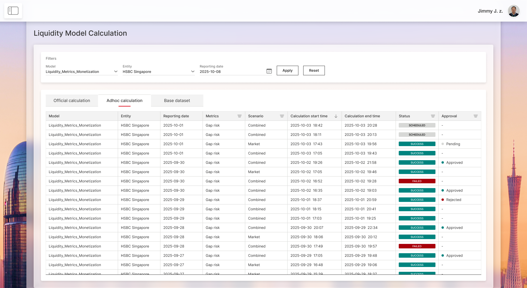
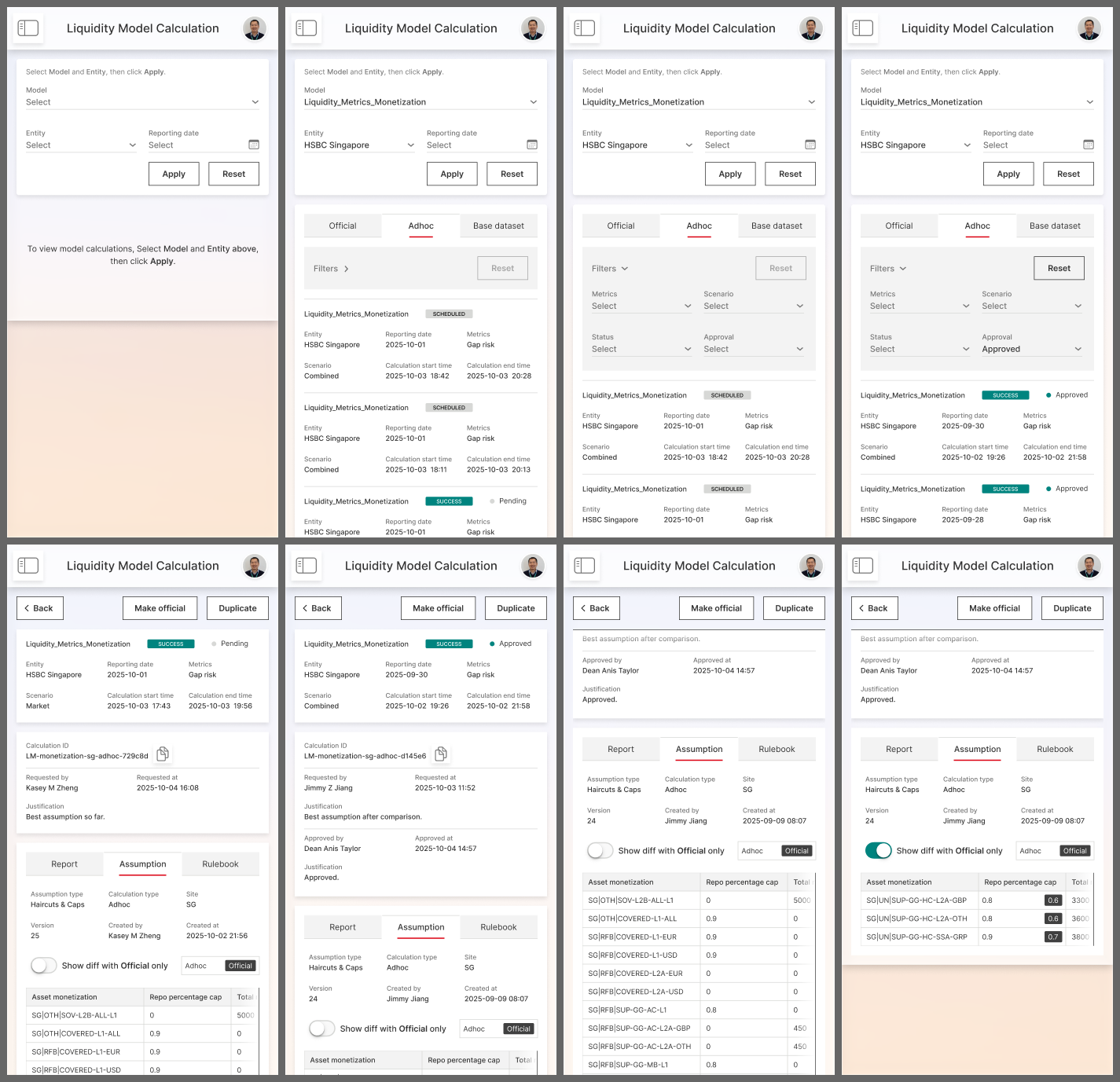
Below are sample screens for the above model calculation features:
In mobile view, the condensed table layout is adapted into a card-view design:
Design System
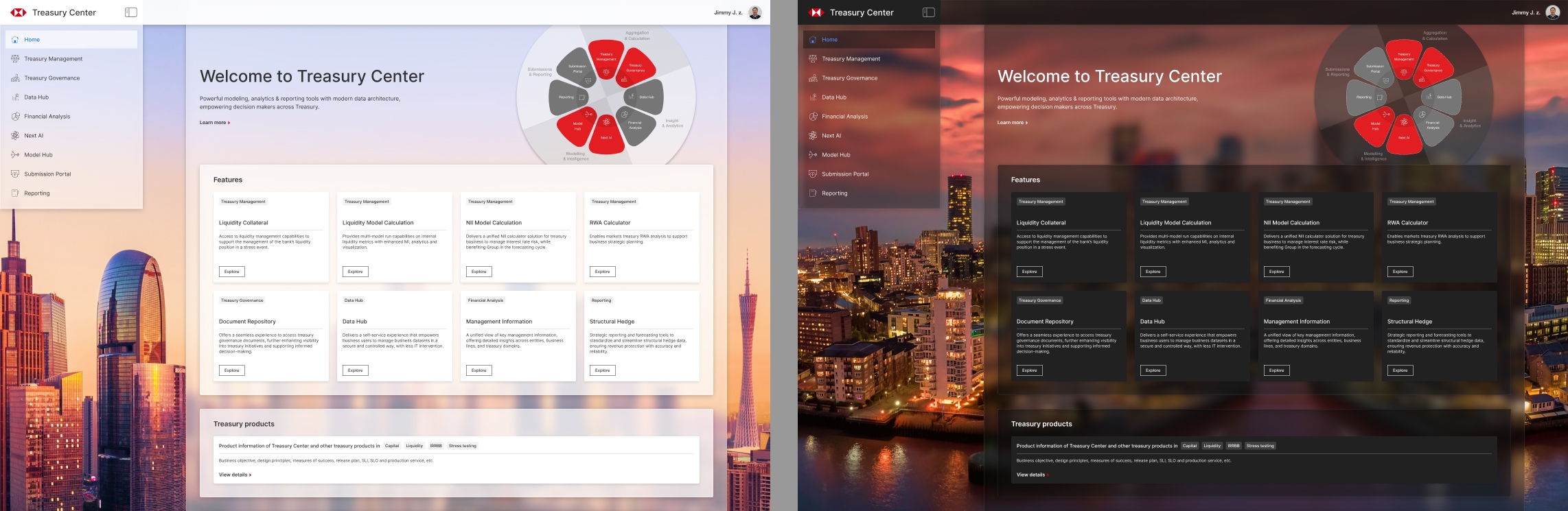
We built the design system based on the bank's global design guidelines, and introduced some UI style innovation, such as the glassmorphism visual effect.
We aimed to fully support dark mode from the very beginning. Users can switch between light mode and dark mode at any time.
Below are some examples from the design system:
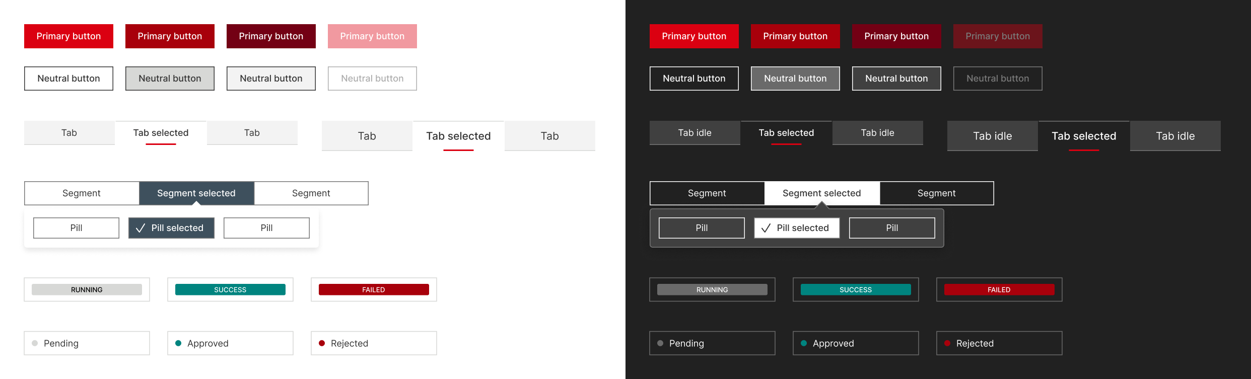
UI components in light mode and dark mode

Glass material UI panel
In light mode, we chose a photo of the city where most teammates are located as the background image. While in dark mode, we followed the same concept but used a photo of the city where our leaders are located.
Retrospective
What I learned from this experience:
- There is no 'absolutely right or wrong' design in some cases. What feels intuitive to one user may not work for another.
- Respect users' existing behavior, and make changes cautiously.
- Break down complex problems into a step-by-step solution.
- Explore as many edge cases as possible, before handing over the design to development.
Copyright © 2026 [suizai] Jimmy J.z. All rights reserved.
Website registered in CN Guangdong. ICP-16083064